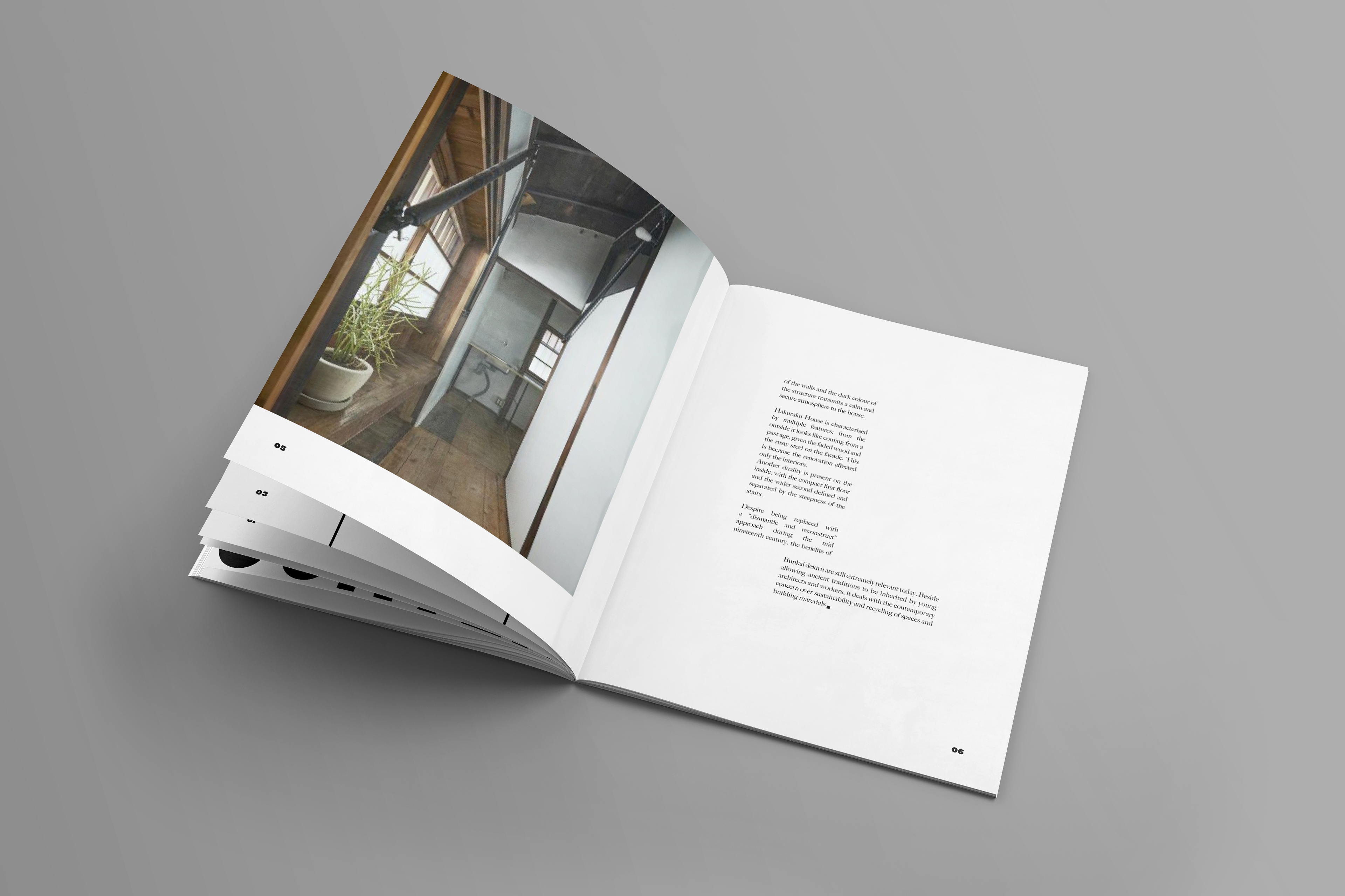
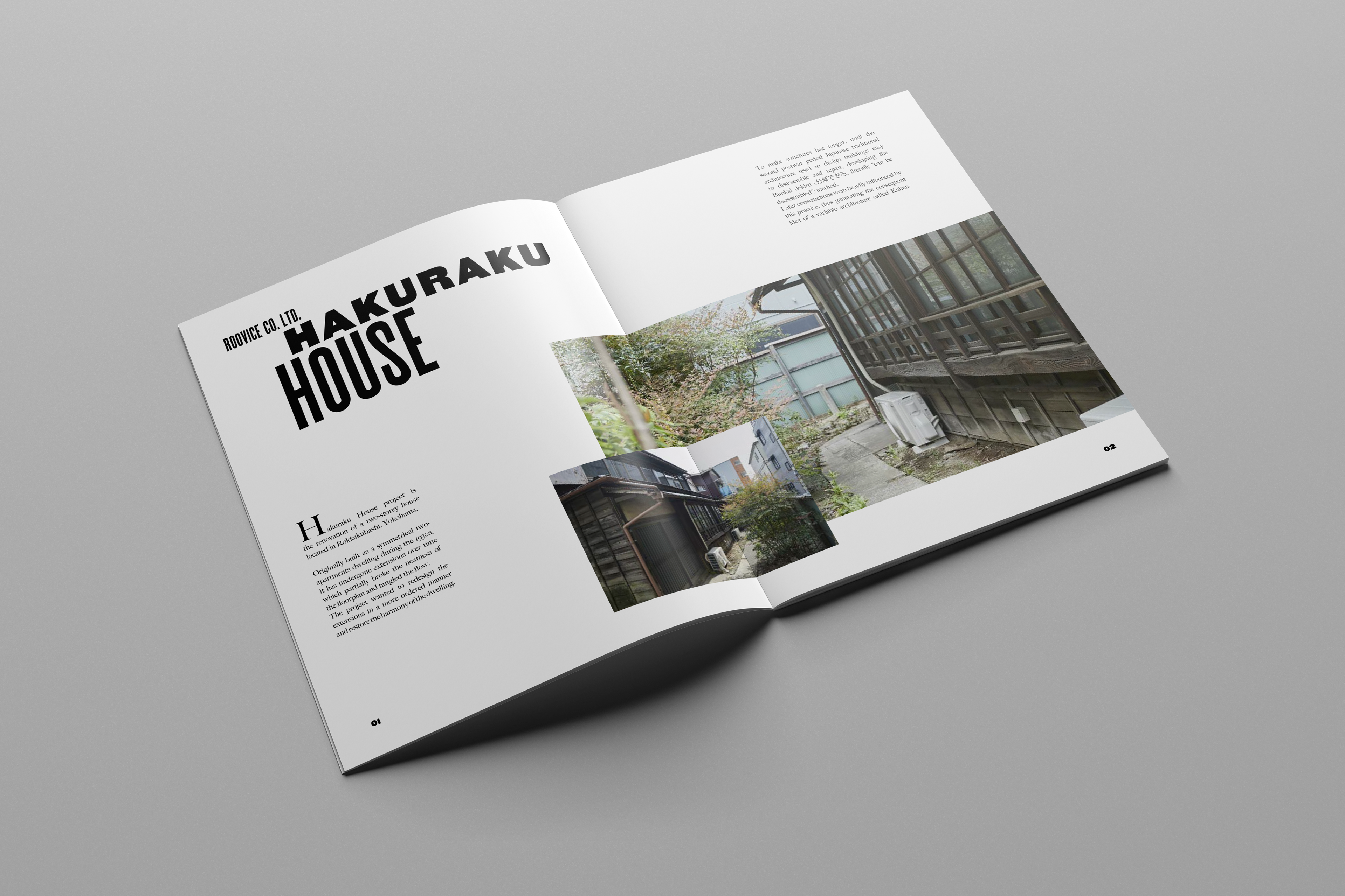
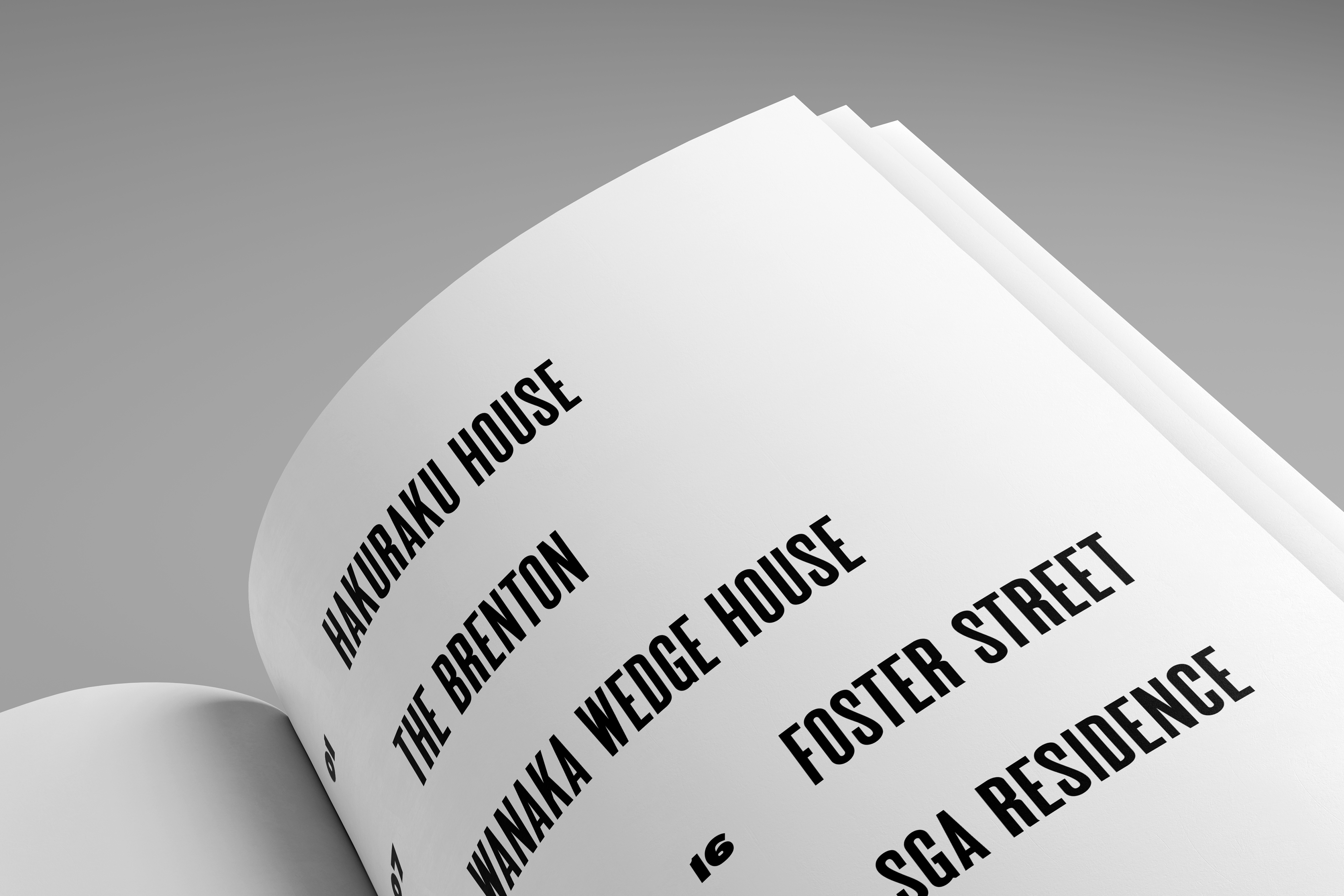
The Architect Magazine is the premier platform for industry news and building resources for architects and industry professionals. I rebuilt a simpler grid system and pairing typefaces for practice in creating an editorial design. I employed different styles and sizes of MPI Gothic for the title and headers with Big Caslon Media for the body copy.
I love the style of modern design in its simplicity, which I replicated in the simplicity of the spread. As your eyes draw across the type to the pictures, you’re able to focus on the beautiful aspect of each piece of architecture. Modern architecture can be as simple as a rectangle or as complex as an octagon with it’s shape. I replicated this in the body copies by separating different paragraphs, so the reader could understand that modern architecture can be beautiful in both ways.


