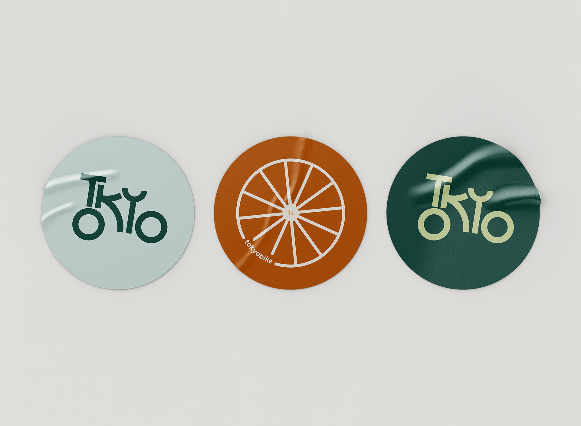
TokyoBike is a company based in Los Angeles, California. They had a logotype but not an actual pictorial logo. I first looked up elements of Japanese typography and they included: thick strokes, curves, and unique lettering; I modeled the new logo in this same manner with thick strokes and curvatures.
When looking at the letters, I realized that the two O’s in Tokyo looked like wheels. I then manipulated the letters into the shape of a bike to help bring across the message of it being a bike company.


